Before knowing how to plot something, you should know what you want to plot:
Scenario
Which plot
R command
Numeric
Histogram or boxplot
hist(num) and boxplot(num)
Numeric with numeric
Scatterplot
plot(num~num)
Numeric with categorical
Boxplot
boxplot(num~cat)
Categorical with categorical
mosaicplot or grouped barplot
mosaicplot(table(cat, cat)) or barplot(data, beside=TRUE)
Here is a website with a decision tree about when to choose which plot.
Once you know what you want to plot, there are lot of websites that will show you the respective R code. One important consideration, however: there are at least two popular ways of doing R graphs:
base R: The graphics package is automatically shipped with the R language and is the default plotting package in R. It produces basic scientific plots (no unnecessary information)
ggplot2 is a plotting package where the default plots are more visually appealling, it belongs to the tidyverse, which is a group of packages with a different grammar for coding in R.
You should probably get to know both types, but we recommend to start with base R. We are just saying this so that you are not confused, because a lot of the examples will also show you ggplot code. Here some useful links:
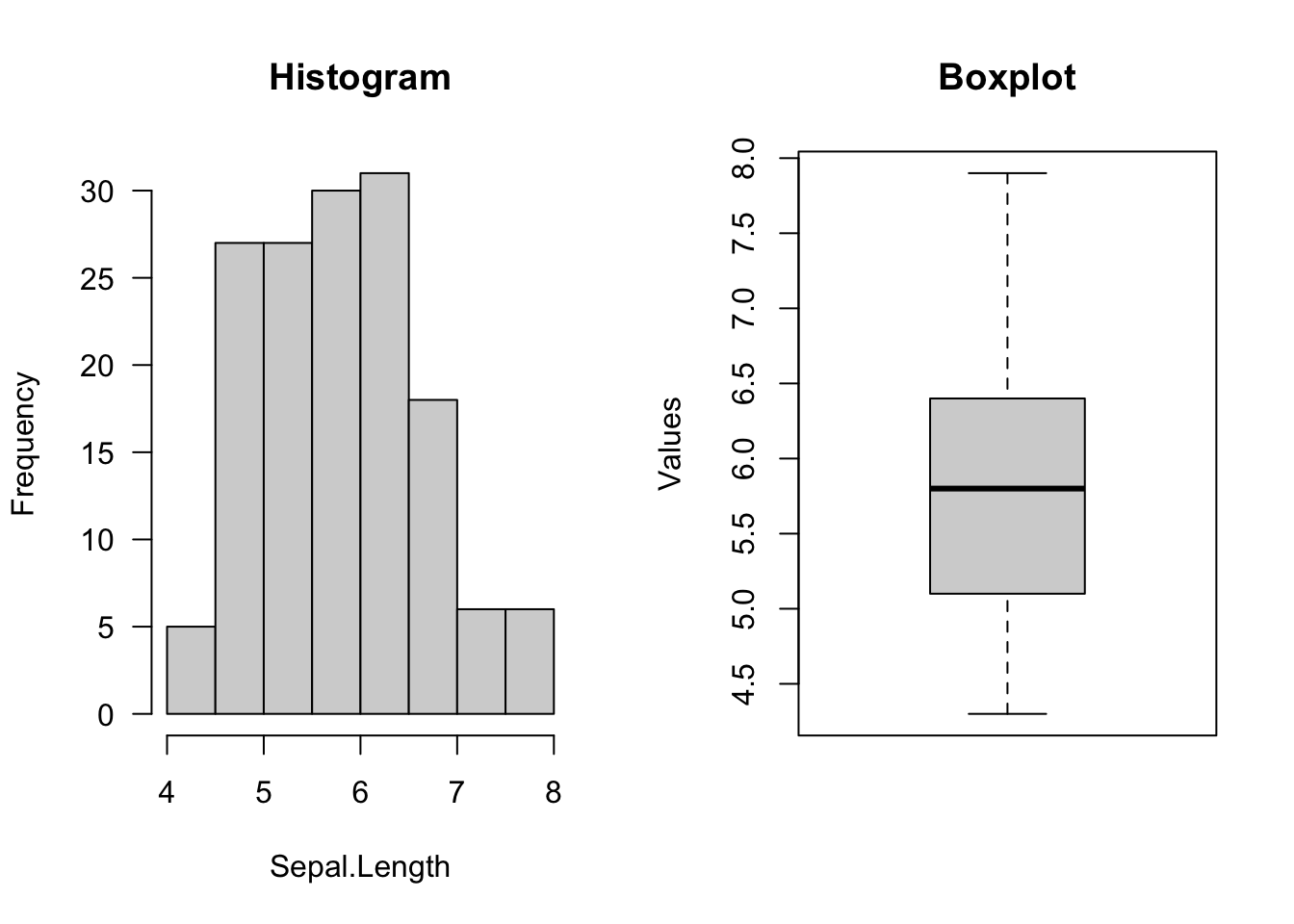
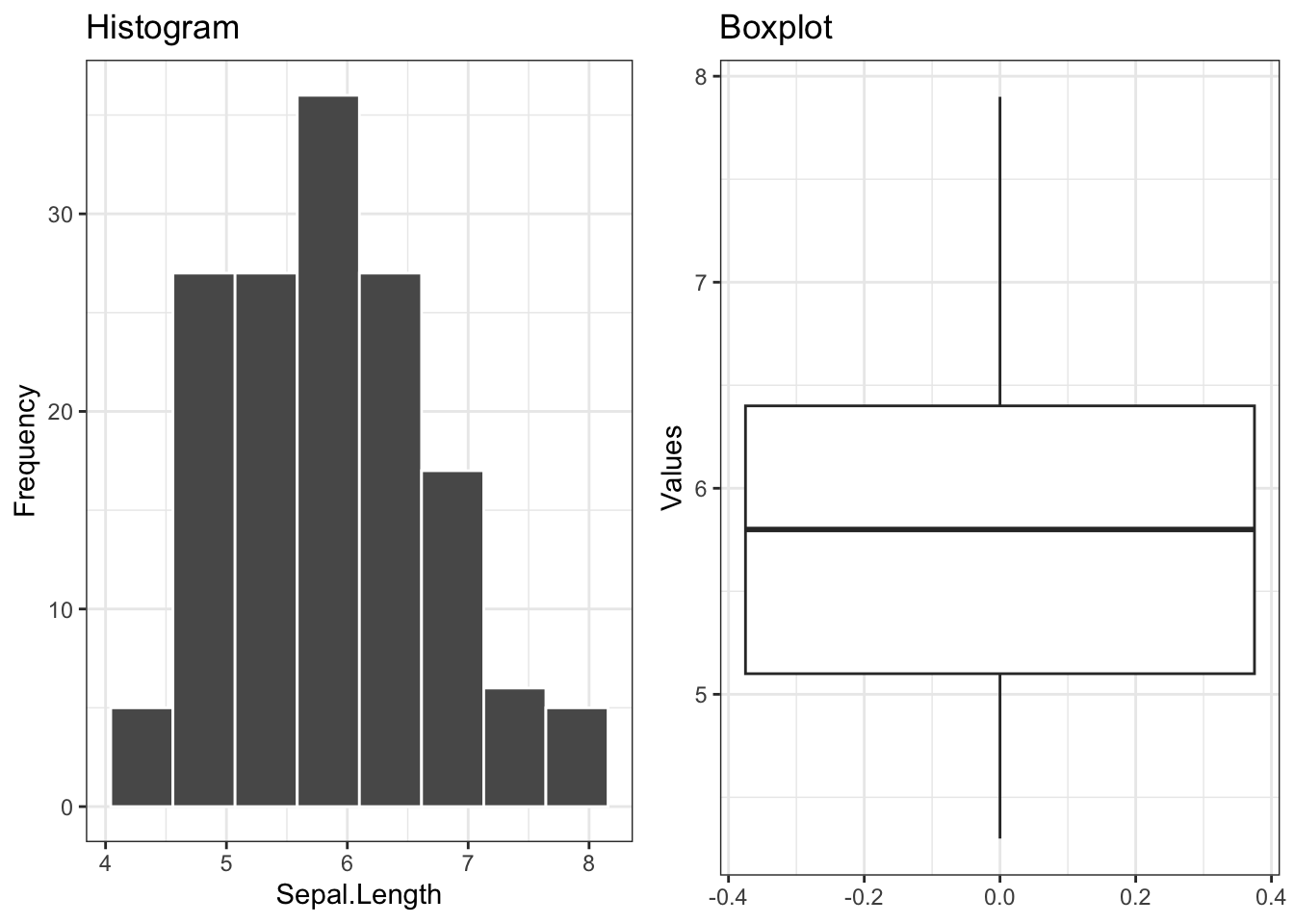
The histogram plots the frequency of the values of a numerical variable with bins (otherwise each unique value will appear only once, the range will be cut in n elements). The number of bins is automatically inferred by the function but can be also changed by the user
The boxplot plots the distribution of a numerical variable based on summary statistics (the quantiles). The boxplot is particular useful for comparing/contrasting a numerical with a categorical variable (see below)
In the base R code we introduced par() before plotting to create a panel with the plots side by side. In ggplot2 this is done with the package ggpubr (or patchwork).
par(mfrow =c(1,2)) # number of plots, one row, two columnshist(iris$Sepal.Length, main ="Histogram", # titlexlab ="Sepal.Length", ylab ="Frequency",las =1) # rotation of x and y values (las = 1, all of them should be horizontal)boxplot(iris$Sepal.Length, main ="Boxplot", # titleylab ="Values")
library(ggplot2)library(ggpubr)plt1 =ggplot(iris, aes(x = Sepal.Length)) +geom_histogram(bins =8,col="white") +# same number of bins from baseRggtitle("Histogram") +xlab("Sepal.Length") +ylab("Frequency") +theme_bw() # scientific theme (white background)plt2 =ggplot(iris, aes(y = Sepal.Length)) +geom_boxplot() +ggtitle("Boxplot") +ylab("Values") +theme_bw() ggarrange(plt1, plt2, ncol =2L, nrow =1L)
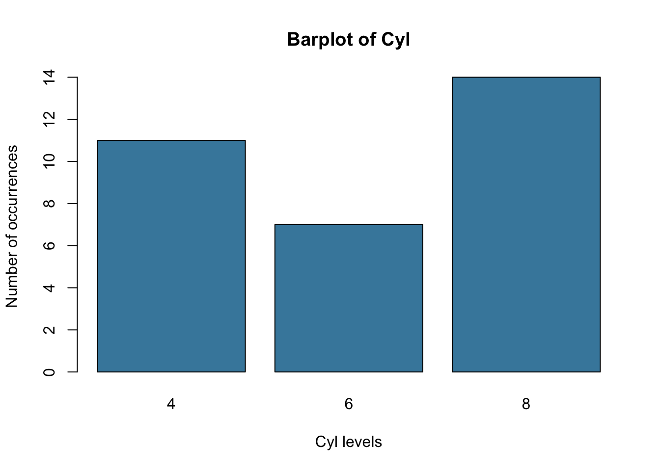
barplot(counts, main ="Barplot of Cyl",ylab ="Number of occurrences",xlab ="Cyl levels",col ="#4488AA")
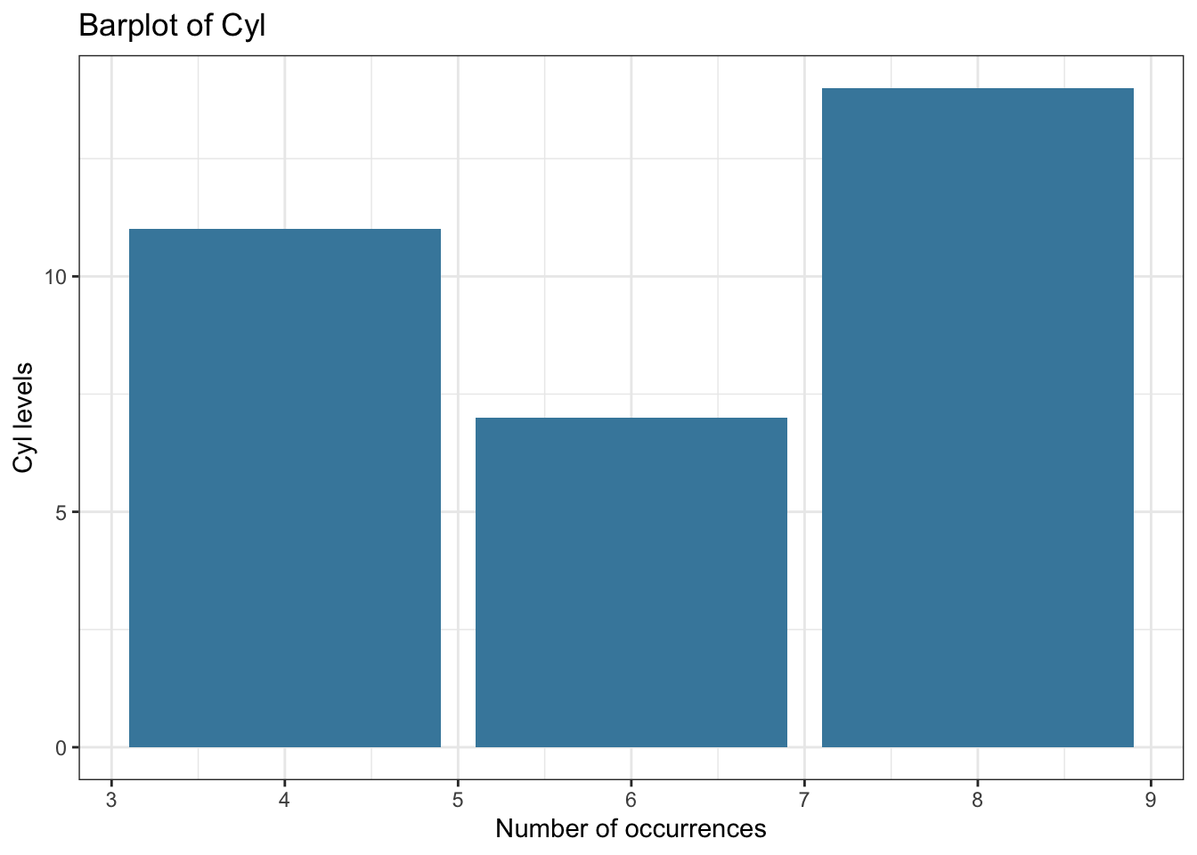
ggplot(mtcars, aes(x = cyl)) +geom_bar(fill ="#4488AA") +ggtitle("Barplot of Cyl") +xlab("Number of occurrences") +ylab("Cyl levels") +theme_bw()
5.2 Plotting TWO variables
The general idea of plotting is to look for correlations / associations between variables, i.e. is there a non-random pattern between the two variables.
5.2.1 Numerical vs numerical variable - Scatterplot
The formula syntax can also be used for plot functions in base R.
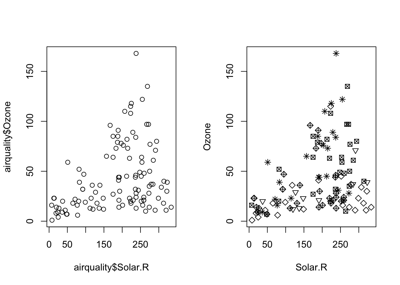
I “turned off” the legend in plot 2 to be similar to base R plot. Try with show.legend = T to see the legend. Also, I had to convert Month to a factor to get different shapes.
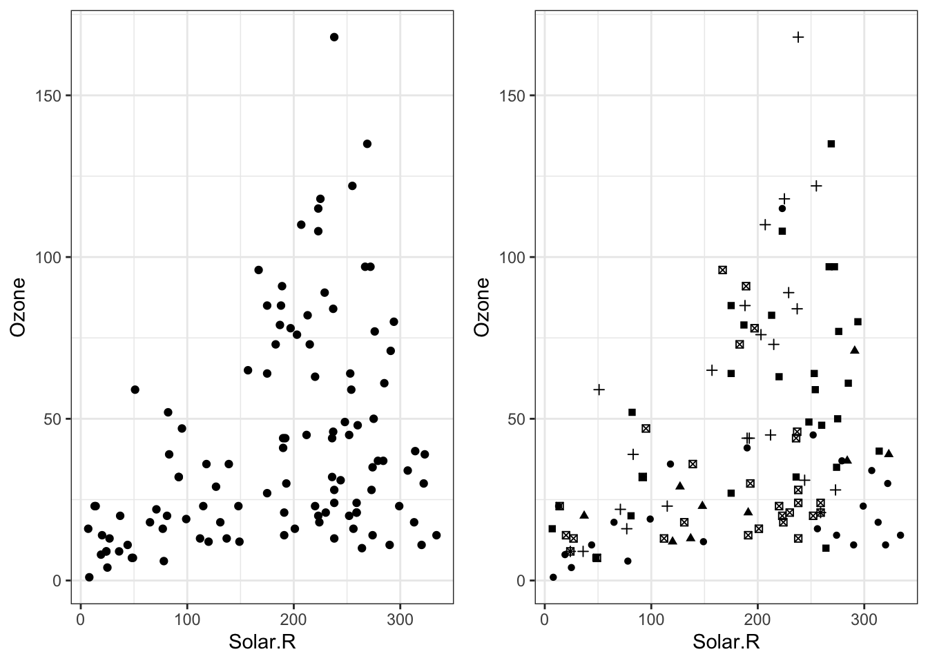
# Scatterplotpar(mfrow =c(1,2))plot(airquality$Solar.R, airquality$Ozone)# plot(Ozone ~ Solar.R, data = airquality) #the same# different symbol for each monthplot(Ozone ~ Solar.R, data = airquality, pch = Month)
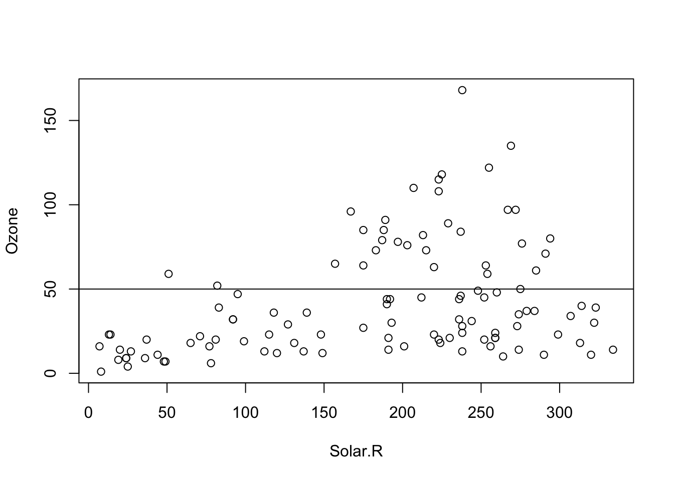
We can also add other objects such as lines to our existing plot:
par(mfrow =c(1,1))plot(Ozone ~ Solar.R, data = airquality)abline(h =50)
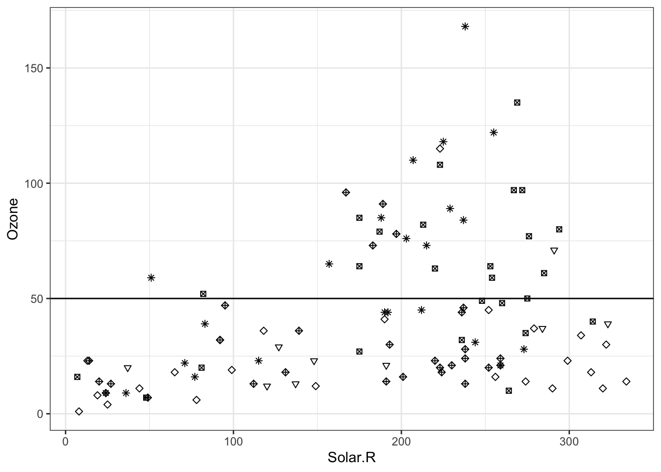
We can also add other objects such as lines to our existing plot:
ggplot(airquality, aes(x = Solar.R, y = Ozone)) +geom_point(shape = airquality$Month) +geom_abline(intercept =50, slope =0) +theme_bw()## Warning: Removed 42 rows containing missing values or values outside the scale range## (`geom_point()`).
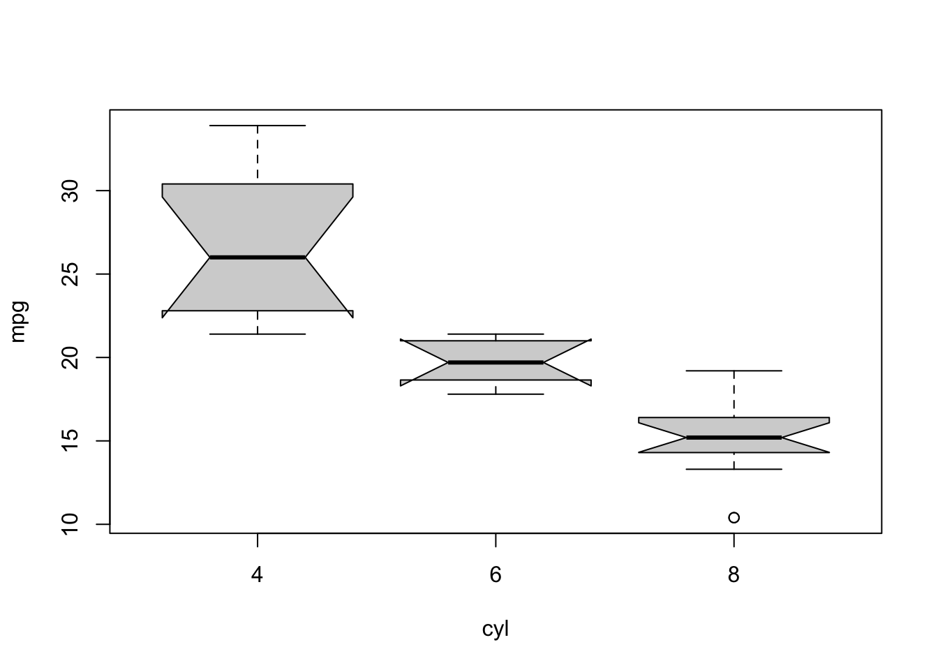
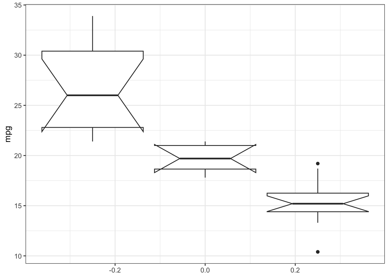
5.2.2 Categorical vs numerical variable - Boxplot
Often we have a numerical variable (e.g. weight/fitness) and a categorical vairable that tells us the group of the observation (e.g. control or treatment). To compare visually now the distributions of the numerical variable between the levels of the grouping variable, we can use a boxplot
boxplot(mpg ~ cyl, mtcars, notch=TRUE) # formula notation
# boxplot(x = mtcars$cyl, y = mtcars$mpg) # the same
ggplot(mtcars, aes(y = mpg, group = cyl)) +geom_boxplot(notch=TRUE) +theme_bw()## Notch went outside hinges## ℹ Do you want `notch = FALSE`?## Notch went outside hinges## ℹ Do you want `notch = FALSE`?
TipHint:
The notch argument adds a notch to the boxplot, which gives a visual indication of the confidence interval around the median. If the notches of two boxes do not overlap, it suggests that the medians are significantly different at the 5% significance level. Try notch = F and see what you get.